Struggle:
1. One of the struggling fact was how I can convey the story from these moving paintings. It's surprisingly difficult for realism painting which later on will be changed to moving painting and tell the story to audiences. How is this possible and how can I achieve this by using which elements?
2. The use of After Effects - its my first time using this software and need to get use to it as soon as possible.
I'm rather fluent at using Photoshop, Illustrator and Zbrush but using After Effects is a different case.
3. The timing of the animation: How long does it need to be and which scenes of painting needs to be in the order? It's easy to put intro and outro but the rest needs to be in certain order to be able to convey the story flawlessly.
Improvement:
1. The use of criteria in the project is going rather in the progress (as it should be).
2. Paintings are nearly done and only parts that needs to be done now is more research on how to make these paintings into an animation by using After Effects.
Wednesday, 30 March 2016
Tuesday, 29 March 2016
Changes within the project
There are some minor changes within the project and it isn't going be like a huge difference and change the subject/project entirely. I will continue using the Photoshop software due to its comfortable keybindings, set-ups and have been using this for years (rather than using Artrage or Black Ink, which is other software just like Photoshop but has its own unique settings).


??? 
After using Photoshop to complete all the paintings, I will move these files into After Effects to modify them to give the movement feeling.
Unfortunately, the use of NukeX software will be either minimum or literally non-existence. It is already difficult and still in a learning stage (using After Effects) and if I have to learn and use another software on top of that, it seems like its just unnecessary and adding more time to spend on learning about this specific software as well. This is a software which I want to use more effectively later on but at this moment, it seems it will be a burden for the project.
Monday, 28 March 2016
Other lists for potential case study material 2
Other potential area would be film industries, where everything and variety of genre can be explored.

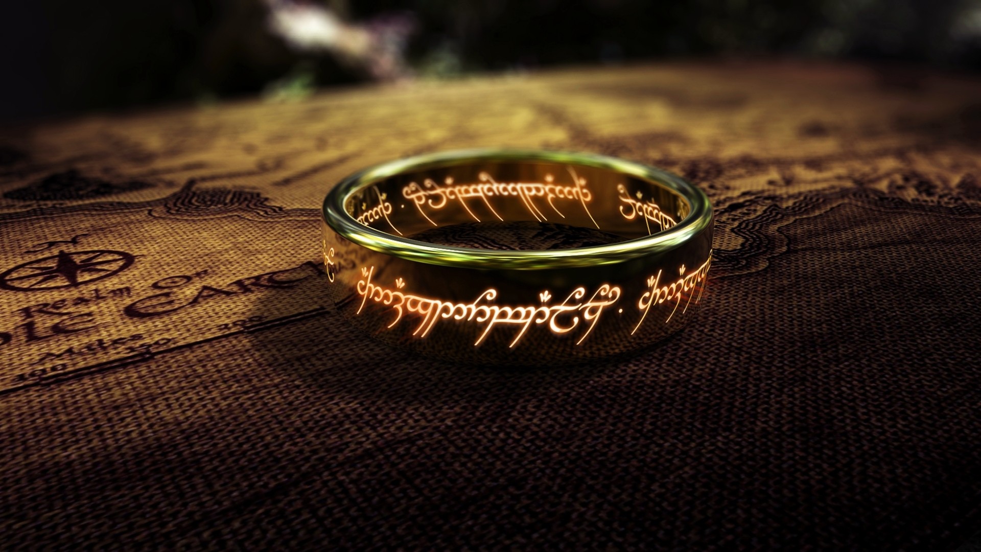
Lord of the Rings Franchise
1. Lord of the Rings Franchise
2. Key object which requires for the story to continue, the ring.
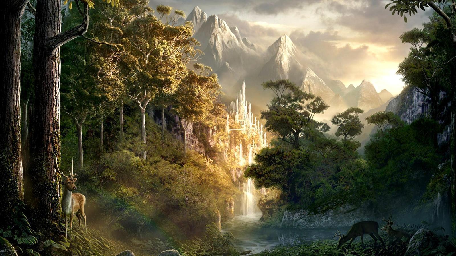
3. Concept art for the environment setting
Most of people have seen this movie (a cult classic in Fantasy genre, written by J.R.R.Tolkien) have been inspired by it and has produced several other animations, films or video games in similar genre.
In one of the interview about the movie, The Lord of the Rings, an interviewer has asked: 'What is magical realism? How is it different than fantasy?'
- In magical realism the world appears much like our own, but also includes an element of the extraordinary. In Franz Kafka’s “The Metamorphosis,” Gregor Samsa awakes one morning to find he has turned into a giant insect. ..... In The Fragrance of Guava, Garcia Marquez argues that strictly realistic literature can be “too static and exclusive a vision of reality.” Though it stretches the bounds of reality, magical realism acknowledges that magic is inherent in our day-to-day life.
Fantasy is very different. While magical realism situates readers in a predominantly realistic world, fantasy takes place in an unreal world with unreal characters. J.R.R. Tolkien’s The Lord of the Rings trilogy is a popular example of fantasy. The trilogy’s characters include Hobbits, who are little people with big feet, as well as Elves, Dwarves, Fairies, Ents, and Wizards. It also features a ring that bestows power but corrupts those who possess it. Fantasy creates different places and species, ones that exist outside of our world. While magical realism stays grounded in our own reality, fantasy breaks free of it.
It is possible for us to believe that there is a magic which therefore the magic is 'inherent in our day to day life.' Despite the fact that The Lord of the Ring trilogy has its potential, personally, I thought the use of video game which the involvement of characters and the surrounding can be depicted much better compare to films.
Link:
Sunday, 27 March 2016
Further inspiration
During the process of painting, inspirations are always a preferred and will be useful later on if there is any improvement which can be done within the project.
- Oliver Pengilley - Moving Paintings Concept Art
- Frightprops - Haunted Moving Painting
- Jakub Javora - moving concept - lava holes, Lifted stones - motion concept art
Oliver Pengilley 'Moving Paintings Concept Art'
Haunted Moving Painting
moving concept - lava holes
Lifted stones - motion concept art
Links:
1: https://www.youtube.com/watch?v=5e349oGwomw
2: https://www.youtube.com/watch?v=Ym7KelUq7iA
3: https://www.youtube.com/watch?v=BjFT3moxbN8
4: https://www.youtube.com/watch?v=4J4qhIHxgdw
Saturday, 26 March 2016
Other lists for potential case study material 1
Even though I have recently chosen the case study for my dissertation, The Last of Us, why not go little bit more abroad and find more potential case study materials?
Let's go little bit deeper into the genre of gaming industries and similar games like The Last of Us:
1. Bioshock Franchise

2. Bethesda - 'Skyrim'

3. CD Projekt RED - The Witcher 3: Wild Hunt
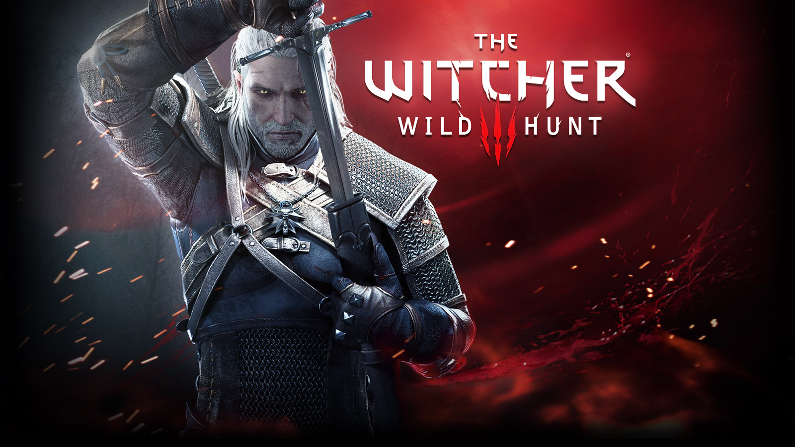

I'm going to talk about the Skyrim and The Witcher 3: Wild Hunt, at the same time since the similarities of these two games are impeccable and has realistic view for its setting, however, this does not mean that these two games are exact replica in same genre. Skyrim is more sandbox theme with the aspect of the player can become anything that you would like to be within game's limit whereas Witcher 3 has more considerable features in environment and characters (to make them realistic as possible for players to feel like they are the monster hunter). Another difference is that in witcher 3, you have a certain role and fulfill these tasks as this specific character. However, the environment and the theme, hunting insane monsters such as dragons, griffins or vampires is all mythical creatures that do not exist and gave away the meaning and one of the criteria in the methodology of mine, Realism.
Link
1: http://static.gamespot.com/uploads/original/1179/11799911/2532355-bioshockseries.jpg
2: https://geoheritagescience.files.wordpress.com/2013/01/skyrim-mountains.jpg
3: http://compass.xbox.com/assets/71/35/71351161-ad9d-414d-af6a-a08880fcf7b3.jpg?n=witcher3_games_hero_1460x820_04.jpg
4. http://cdn3.dualshockers.com/wp-content/uploads/2015/03/Witcher3.jpg
Let's go little bit deeper into the genre of gaming industries and similar games like The Last of Us:
1. Bioshock Franchise
1. Bioshock Franchise
Bioshock franchises have been successful due to its unique concept styles for characters and environment. The choice of colour during Bioshock 1 - 2 is rather similar, since the setting for this game hasn't changed significantly, and that goes to the character design as well. However, Bioshock infinite has changed the entire view of Bioshock generation and came up with much brighter, better colour palette and different style, even to the concept of using 'multiple universe & time travelling'.
Unfortunately, even though the game-play and the unique elements of this particular game does not match with certain criteria, for example, it is still impossible for humans to think that we are capable to build a city underneath a sea or above the cloud - which does not correlate with the 'Realism', compare to The Last of Us, even the fact that the cause of the disease has already happened to insects and by tweaking the idea that it could affect to humans as well gave the impression of realism.
Bioshock Infinite Gameplay
2. Bethesda - 'Skyrim'
Skyrim
3. CD Projekt RED - The Witcher 3: Wild Hunt
The Witcher 3: Wild Hunt
In-game environment scene in 'The Witcher 3: Wild Hunt'
I'm going to talk about the Skyrim and The Witcher 3: Wild Hunt, at the same time since the similarities of these two games are impeccable and has realistic view for its setting, however, this does not mean that these two games are exact replica in same genre. Skyrim is more sandbox theme with the aspect of the player can become anything that you would like to be within game's limit whereas Witcher 3 has more considerable features in environment and characters (to make them realistic as possible for players to feel like they are the monster hunter). Another difference is that in witcher 3, you have a certain role and fulfill these tasks as this specific character. However, the environment and the theme, hunting insane monsters such as dragons, griffins or vampires is all mythical creatures that do not exist and gave away the meaning and one of the criteria in the methodology of mine, Realism.
Link
1: http://static.gamespot.com/uploads/original/1179/11799911/2532355-bioshockseries.jpg
2: https://geoheritagescience.files.wordpress.com/2013/01/skyrim-mountains.jpg
3: http://compass.xbox.com/assets/71/35/71351161-ad9d-414d-af6a-a08880fcf7b3.jpg?n=witcher3_games_hero_1460x820_04.jpg
4. http://cdn3.dualshockers.com/wp-content/uploads/2015/03/Witcher3.jpg
Wednesday, 23 March 2016
Project Outro: progression 1
Project: Outro
Same structure as intro but in different style and vice versa in colour palette.


Project Intro: progression 1
Project: Introduction
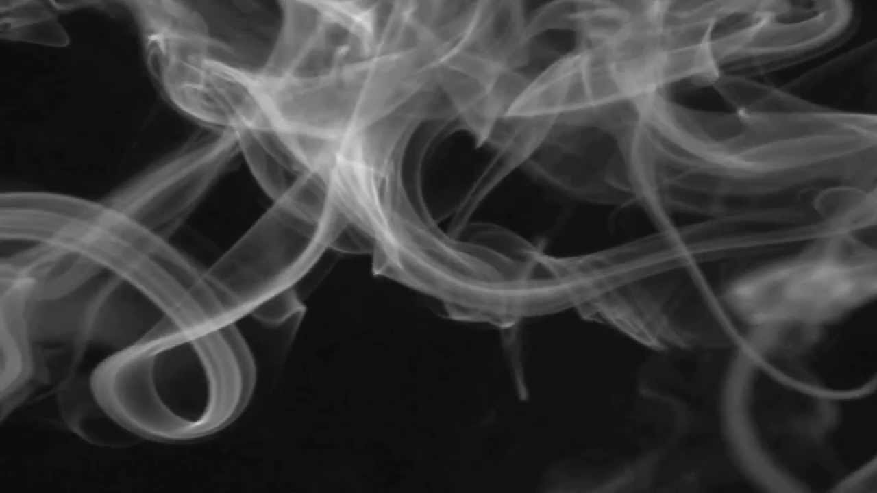
This part was rather simple yet delicate since this is the very first image which will be shown in the animation and needs to be carefully chosen and drawn. Use of smoke brush certainly saved significant amount of time!


This part was rather simple yet delicate since this is the very first image which will be shown in the animation and needs to be carefully chosen and drawn. Use of smoke brush certainly saved significant amount of time!


Tuesday, 22 March 2016
Project: Outro
Project: Outro
Outro animation will be similar to the introduction animation but personally, I don't think its necessary to change the outro to be more outstanding or inferior to the introduction. It's timing is similar as intro (around 9~10 seconds) and the concept of using smoke will be same but the colour of the smoke is different. This time, the smoke's colour will be white rather than black and vice versa to the environment.
The animation for intro and outro will be different to identify easily rather than depending on its timeline (Intro will begin from 0~10seconds and outro will begin from 2:15:00 ~ 2:25:00). It needs to have its specialised part where people can tell which part is in which section. Another factor to be mentioned is that the design of intro and outro is rather similar due to its use of smoke and even the text 'The Journey'. To differentiate this, I thought of using different transparency timing (0% to 100% in intro and vice versa in outro).

Link:
1: https://i.ytimg.com/vi/_tyZGRHRluY/maxresdefault.jpg
2: https://i.ytimg.com/vi/oz8wYj6G_R0/maxresdefault.jpg
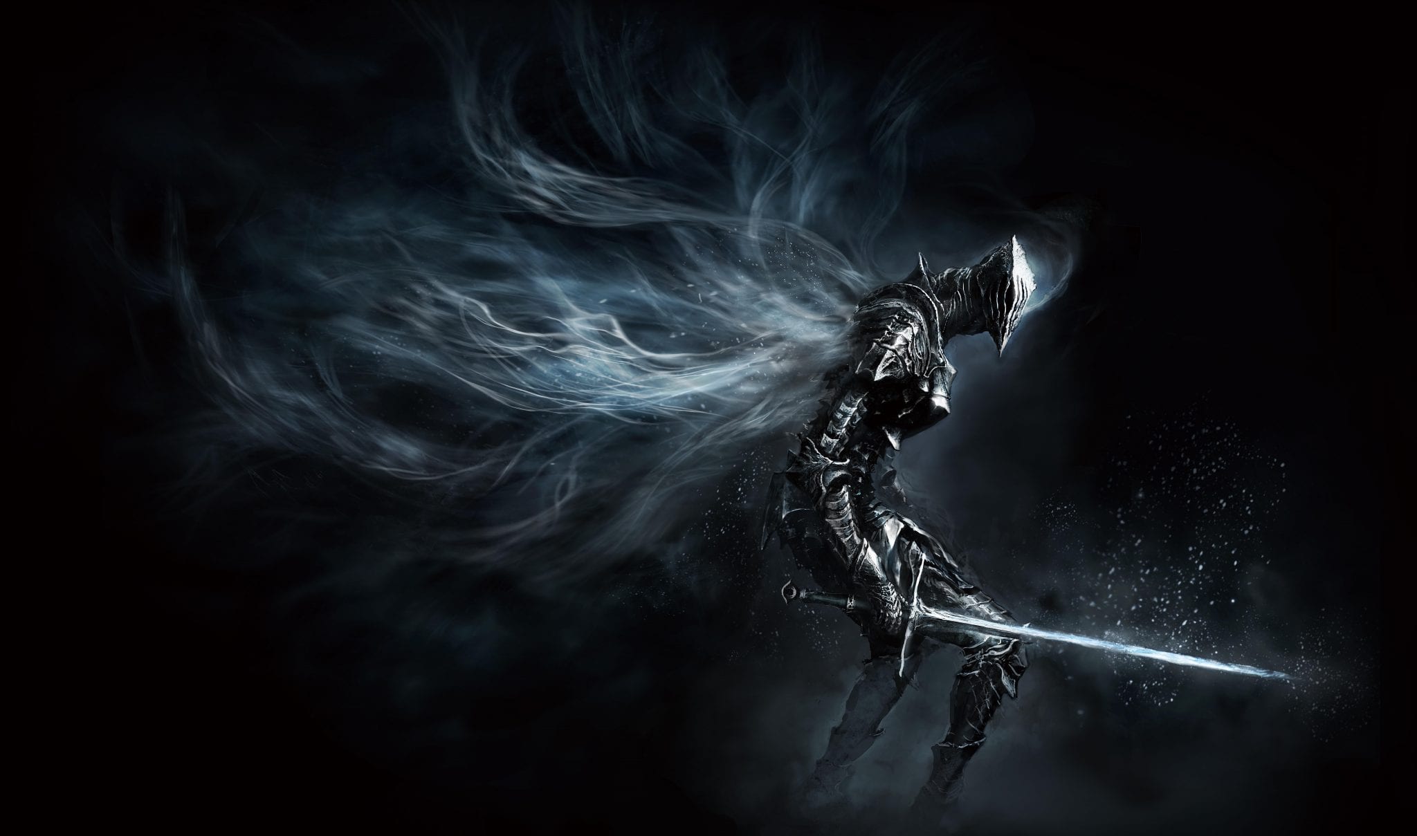
Dark Soul 3 Link:
http://d1vnh8mbrp67em.cloudfront.net/screenshot/image/0/72/285150/1438888629-1.jpg
Outro animation will be similar to the introduction animation but personally, I don't think its necessary to change the outro to be more outstanding or inferior to the introduction. It's timing is similar as intro (around 9~10 seconds) and the concept of using smoke will be same but the colour of the smoke is different. This time, the smoke's colour will be white rather than black and vice versa to the environment.
The animation for intro and outro will be different to identify easily rather than depending on its timeline (Intro will begin from 0~10seconds and outro will begin from 2:15:00 ~ 2:25:00). It needs to have its specialised part where people can tell which part is in which section. Another factor to be mentioned is that the design of intro and outro is rather similar due to its use of smoke and even the text 'The Journey'. To differentiate this, I thought of using different transparency timing (0% to 100% in intro and vice versa in outro).
Dark Soul 3 Concept
Link:
1: https://i.ytimg.com/vi/_tyZGRHRluY/maxresdefault.jpg
2: https://i.ytimg.com/vi/oz8wYj6G_R0/maxresdefault.jpg
Dark Soul 3 Link:
http://d1vnh8mbrp67em.cloudfront.net/screenshot/image/0/72/285150/1438888629-1.jpg
Project: Introduction
Project: Introduction
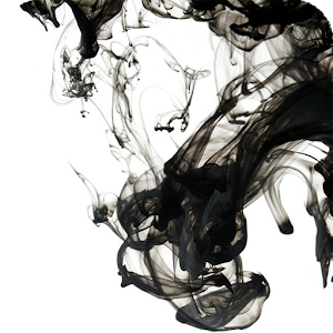
For the introduction of the animation, simple but effective intro is necessary. Introduction will last for around 10 seconds and to match the theme 'Journey', rather than focusing on the use of environment which already has been researched and painted, maybe something detailed yet simplistic design is required. Smoke seems to be one of those object which fulfills its needs and I've begun to research and find some visual research material for introduction animation.
Images below are some of the sample images which might be able to help to construct the ground work for the introduction part.


Link:
1: http://vignette2.wikia.nocookie.net/narutoprofile/images/4/45/Black-Smoke.jpg/revision/latest?cb=20140509035055
2: http://www.wallpapervortex.com/ipad_air_wallpapers/ipad_air_27258_1_miscellaneous_digital_art_black_black_smoke.jpg
3: http://www.suiteny.com/blog/wp-content/uploads/2015/10/BLACK-SMOKE-modern-furniture-SUITE-NY-blog.jpg
For the introduction of the animation, simple but effective intro is necessary. Introduction will last for around 10 seconds and to match the theme 'Journey', rather than focusing on the use of environment which already has been researched and painted, maybe something detailed yet simplistic design is required. Smoke seems to be one of those object which fulfills its needs and I've begun to research and find some visual research material for introduction animation.
Images below are some of the sample images which might be able to help to construct the ground work for the introduction part.
Link:
1: http://vignette2.wikia.nocookie.net/narutoprofile/images/4/45/Black-Smoke.jpg/revision/latest?cb=20140509035055
2: http://www.wallpapervortex.com/ipad_air_wallpapers/ipad_air_27258_1_miscellaneous_digital_art_black_black_smoke.jpg
3: http://www.suiteny.com/blog/wp-content/uploads/2015/10/BLACK-SMOKE-modern-furniture-SUITE-NY-blog.jpg
Sunday, 20 March 2016
Project no.5: progression 2
Arrival

The last painting is the end of the journey,
thus; the title ‘Arrival’ suited to demonstrate the end of the journey for the
protagonist. The environment is set in a coastline heading towards to small
harbour. The end of the journey for the protagonist has provided the many
facets of nature.
The colour scheme of the Arrival is mainly focused on the use
of blue and white due to the setting and to match its realistic view, the
composition of the painting was also adjusted to its requirement. Compositionally,
the setting of the painting and the use of elements is rather similar to the
first painting, ‘Tranquillity’. The return of the protagonist indicates the end
of the journey, back to his habitat and to match its surrounding, the use of
elements should be identical or similar to the first painting. It is because of
these settings, precise proportion of the character or its surrounding objects
and deconstruction of the painting specifies visual narrative and realism
within the painting.
This is the last painting and it is time for me to check each painting again if there are any problems with its composition, if there are any excessive use of elements, and if its realistic enough (then later on if this painting is able to convey the story as a visual narrative etc).
Saturday, 19 March 2016
Project no.5: progression 1
Same process will take but few different parts would be the combination of two layers rather than each layer, for example, since the character is already on the yacht, it would be more proficient for me to put them in one layer and animate it later on.

Thumbnail

Background/Sky

Sea/Ground

Character/Boat

Combination of these layers (without smoke or light)
Friday, 18 March 2016
Feedback from the presentation 1 - Semester 2
Presentation Feedback
1. Visual presentation was rather in good position in my opinion and surprisingly not a lot of opinion has been said. Personally, I did not like this since I do like criticism which can be used to improve the project and the outcome in the end. I knew there were something off about the 'moving painting' since it seemed bit rigid but at the moment, it will run smoothly with further progress.
2. Another factor which I haven't noticed was the file size. I knew instantly that it would be ridiculously big to play and create unnecessary buffering and cause lagging in 10 second video. This didn't happen in my personal computer but I should have realised that it can be affected in different computers due to different specs it have. Therefore, I need to compress the file and make it into a smaller size.
3. One of the question which I've heard and couldn't answer was: 'What is this trying to tell?' or 'How this can be shown with what element?' At that moment, I couldn't really reply back to it unfortunately due to lack of knowledge and deeper understanding of my own research. I realise now that it is the combination of different criteria in literature reviews I have read and written, for example, this project is to convey the visual narrative within the boundaries of the (moving) painting by the use of different elements, such as mise-en-scene, semiotic/sign communication, elements of art, realism (art movement).
From these feedback, hopefully I will be able to improve the project and progress without difficulties.
Tuesday, 15 March 2016
Project no.4: progression 2
Desolation

Progression no.1

Progression no.2

Final Painting
The
fourth panting; ‘Desolation’, is another brutal setting of the journey for the
protagonist, for its environment. It is clearly difficult conditions and the
hardship the protagonist must endure is determined by only using specific
colour scheme and composition of the painting.
Low-key lighting in this scene
creates the ominous mood that suggests the struggle of the protagonist and his
contemplation of the journey. This particular painting was one of the most
interesting moments for the protagonist, particularly done by the use of light
coming in to the cave. It shows the encounter of another tough moment of his journey
and whether the protagonist will continue his journey or stop and meets his
end.
The composition in this painting works perfectly with the appearance of the character. In terms of mise-en-scene, the posture of the character shows the hardship its suffering. Even with the gesture from the protagonist alone is able to convey the story to the audience and certainly to me.
Superviser Meeting no.9
Meeting with Supervisor - David Lyons
- Looking at the most finished part of the animation, which is from no.1 - 5.
- Background music might be useful rather than no music in the animation
- Posters, business card will need to be made and designed.
Priorities
- Finish other part of the animation done as soon as possible.
- Find right background music (something calm and serene, most likely piano music which convey these feelings and personal favourite choice)
Monday, 14 March 2016
Project no.4: progression 1
Same process will take in no.4, Desolation, but this time, the colour palette will be heavily rely on the use of Red, Brown and Black. This sudden change of scene (such as from no.1 to no.2) and composition of the painting provides the feeling of uneasiness and awaits challenging moment for protagonist. This painting was a personal favourite since it was so different compare to other paintings.

Thumbnail

Middle 1

Foreground

Middle 2

Right 1

Ground

Background
Saturday, 12 March 2016
Choice of case study due to its type & reasons
Previously, I have written a post about choices for case studies, and it came down to these 3, 'The Journey', 'The Last of Us' and 'Still life (by Sam Taylor Wood)'. All these case study materials had its potential and most of them had met the requirement for the criteria which I have set on the dissertation. Despite the fact that these materials were exceptional, only 1 will be chosen.


Within these selection, one had to be chosen and it was 'The Last of Us'.
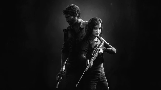
Video games: The Last of Us (left), The Journey (right)
Still life - Sam Taylor Wood
Within these selection, one had to be chosen and it was 'The Last of Us'.
The Last of Us
Type: Video game - Action Adventure Horror Survival
Reason: First of all, it met all the requirement for me to write about this particular case study even though its a video game. I can still deconstruct this game in different scenes and will be able to interpret that exact moment of the game. For example, the use of these protagonist creates the conflict and harmony between them, suggesting hardship and visual storyline.
Links:
Wednesday, 9 March 2016
Time for the dissertation
Dissertation
Before writing the dissertation, you need to get the lists of dialogues/templates to start writing the contents in each catalog. To start with an abstract - simplified version of the dissertation and what I'm researching and writing about. Then few pages of introduction and moving on to literature review, (what I've been reading either in web-sources or in books. Moving on to the methodology and going through over the case study (how each elements and criteria works in this case study).
It is important for me to talk later about the personal project and how these criteria has helped significantly in its own way and how it can be used as a visual narrative within the boundaries of the painting.
Contents
1.0 Introduction
2.0 Literature Review
2.1
Visual Narrative
2.2
Communication through image
2.3
Mise-en-scène
2.4
Artistic movement: Realism
2.5
Formal Elements of Art
3.0 Methodology
3.1
Identifying the criteria
3.2
The Criteria
3.3
Case studies
3.4
The final artefacts
4.0 Results
5.0 Conclusion
Appendix:
Environment Analysis
Contents
1. Analysis
1.1 Individual Images
1.2 Animation
2. Summary
6.0 References & Bibliography
Monday, 7 March 2016
Mise-en-scene
Mise-en-Scene
Mise en scene is basically a term from France: 'Place on Stage', where the arrangement of individual materials are in its place, for example, lighting, props, characters etc. Personally, Mise-en-scene is one of the great asset which will improve the use of elements in my painting and enhance the believability of realistic view in each paintings.

Casablanca, one of the notorious film in 1940s which used black & white filter and because of this setting, they have harmonised the use of low-key setting in each environment.

V for Vendetta uses various colour palette but because of the character's position and the costume, the action he is doing in this specific scene causes audiences to focus in this particular scene. Also, it used a right amount of lighting in this setting which created shadows in each corner of this scene.

In this particular scene in The Pianist is mostly due to character's motion. The sadness its pouring out from the character can be enhanced by tears from the protagonist and the surroundings and its props (no ones around but there are a lot of objects surrounding him, suggesting certain disastrous event has occurred and ultimately made the protagonist to be unhappy).
Links for images above:
1: https://sistercelluloid.files.wordpress.com/2016/02/sis-casablanca-9.jpg
2: http://greenscreencinema.com/20080519123250678_3.jpg
3: https://killerstencil.files.wordpress.com/2012/02/vlcsnap-00083.png
Mise en scene is basically a term from France: 'Place on Stage', where the arrangement of individual materials are in its place, for example, lighting, props, characters etc. Personally, Mise-en-scene is one of the great asset which will improve the use of elements in my painting and enhance the believability of realistic view in each paintings.
Casablanca
Casablanca, one of the notorious film in 1940s which used black & white filter and because of this setting, they have harmonised the use of low-key setting in each environment.
V for Vendetta
V for Vendetta uses various colour palette but because of the character's position and the costume, the action he is doing in this specific scene causes audiences to focus in this particular scene. Also, it used a right amount of lighting in this setting which created shadows in each corner of this scene.
The Pianist
In this particular scene in The Pianist is mostly due to character's motion. The sadness its pouring out from the character can be enhanced by tears from the protagonist and the surroundings and its props (no ones around but there are a lot of objects surrounding him, suggesting certain disastrous event has occurred and ultimately made the protagonist to be unhappy).
Links for images above:
1: https://sistercelluloid.files.wordpress.com/2016/02/sis-casablanca-9.jpg
2: http://greenscreencinema.com/20080519123250678_3.jpg
3: https://killerstencil.files.wordpress.com/2012/02/vlcsnap-00083.png
Subscribe to:
Comments (Atom)