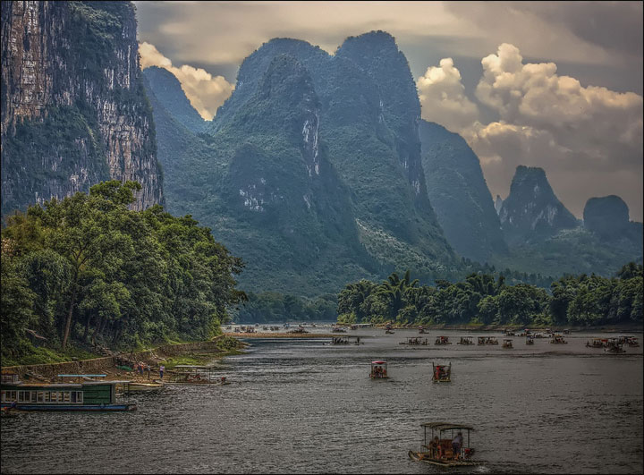
Serenity
Third painting, named ‘Serenity’ has its
resemblance to the Chinese
Tianzi Mountain
‘Tranquillity’ except the fact
that the location is different. The scene, however, of these two paintings may
differ but share a similar atmosphere. The colour scheme and the composition of
the painting enhances the story; its calm nature. The character’s position and
the concept for this specific environment, including heavy usage of smoke
provides serene moment. As the composition of this painting draws audiences
focal point towards to the centre, not the character itself even though the
appearance of the character is vital.
Detailed painting certainly provides better understanding of the situation in the setting and how the character shows its feeling by its posture and even by the gaze towards to the river, symbolising the peaceful rest. This animation in my opinion should be similar to the first painting, Tranquility and put some animations in the river, providing realistic view. Also, the composition of the painting is in its place with two sliding hills going towards to the middle section where the river is, making audiences' focal point goes to the middle section, the river.


