Thursday 17 December 2015

Superviser Meeting no.5

Meeting with Supervisor - Simone O'Callaghan

  • Finding similarities and pointing out the specific parts which I need to 
  • Also, looking up at - The Motionless Look of a Painting: Jules Bastien-Lepage, Les Foins, and the End of Realism by Marnin Young

The meeting was rather short unfortunately but I already know the progress and how it is going to turn out. At the moment, its all about the process and researching more deeply and finding the right part to use.

Tuesday 24 November 2015

Experimental Piece 7: Explore

Explore: Environment setting no.6

New setting, rather than staying on similar environment (mountain, ice, cold etc)
Desert, light colours, dry texture is the next target to focus on.


Processes

Final Image

Monday 23 November 2015

Italy

Italy - Rome, Florence & Venice

 While traveling in Italy, the scenery of each city/town has its own unique views and taste which could be proficient towards to environment setting. Few images will only provide an environment view to paint later on but what I really needed was an image which captures the mixture of environment and characters able to express the moment.


Monday 16 November 2015

Experimental Piece 6: Alabaster

Alabaster: Environment setting no.5

Continuation of a painting, Climb (no.3).


Final Image


Experimentation no.1&2: 1 is to label out the categories within the painting. 2 is to see the difference/change in value of the painting.

Tuesday 10 November 2015

Superviser Meeting no.4

Meeting with Supervisor - David Lyons
  • Minimalism?
  • Abstract movement?
  • How to extract these parts of research area and able to put them into my project?
  • The change of the medium within the project

Priorities:
  • First of all, understanding these topics needs to be done asap.
  • How I can use these materials into my own work and also in writing.
  • Need to recognize and show these mateirals what I'm going to produce

Monday 9 November 2015

Experimental Piece 5: Chef

Chef: Character Design no.1

First experimental character design with a single image to show the identity of the character.


Processes


Finished painting

Thursday 5 November 2015

Feedback from the presentation - semester 1

Presentation Feedback

1. It was still in a stage where I couldn't find a right topic to continue. Only thing I have was the use of formal elements of art and how I can use these elements to create a painting which depicts a story. This was a rather simple and obvious topic and did not have its expectation as a great choice for 4th year project, research proposal and future dissertation writing. This have to be changed as soon as possible.

2. Little bit too much writing during the presentation (I mean literally there were a lot of writing in presentation which it did not look visually appealing).

3. Not a lot of feedback from students and teachers - I kind of understand why: its either too simple/complicated or confusing to some people to ask questions about my research area/project. This presentation was not much of a success but because of this small failure, I can move forward to find something significantly better to improve my project and future writing.

Monday 2 November 2015

Experimental Piece 4: No man's land

No man's land: Environment setting no.4

Journey of a wanderer through an unsightly forest, filled with darkness with dim of light to guide the path.


Experimentation of using value: dark/light

Tuesday 27 October 2015

Experimental Piece 3: Climb

Climb: Environment setting no.3

Adventure of a wanderer towards to the mountain, seeking the truth.

Processes

Finished painting.

Friday 23 October 2015

High-Renaissance's importance and efficiency

High Renaissance is one of the crucial art timeline in history and has its effect towards to the project. This type of art is generally formed in year 1500 even though the starting date hasn't been written or dated. In this era, master artists were not just focused solely on painting or sculpting (artistic side) but other genre, such as Leonardo Da Vinci was also mastered and created many objects in science field or Raphael was a great painter and also an architect.


Pentecost - Tiziano Vecellio

Paintings with symmetrical buildings and characters with different postures always symbolize something immense, a meaning behind the painting. Why such light shining towards to this particular character in the middle? This could be explained by its timeline, it might be because some artists need to create transcendent spiritual figures and moving forwards to an abstraction.

Creation of Adam

Despite the fact of these grandeur pieces of historic paintings, there are still limits on how it can provide elements which you need to progress the project. The composition and the technique these master artists uses certainly benefit my personal painting style and change the visual style as well (even though it might change slightly), if the choice of genre doesn't match with these, which makes these use of style rather meaningless. The use of element, however, can always be useful for creating painting.

Thursday 22 October 2015

Tutor Meeting no.3

Meeting with a tutor - Brian Robinson

  • The work that says something to you
  • Focus on specific aspect, process, context to build up the framework
  • Finding the context of any work
  • Post production/rationalization
Priorities
  • Developing my own voice - how this work shows what I am and how the work can tell about the artist (me).
  • What kind of feelings can be invoked by looking at my work (from audiences perspective)
  • Using the knowledge of craft, using the knowledge through deconstruction of other works: understanding how these other artists use their skills  and techniques to inspire and deliver their message through their work.
  • By using all these, hopefully it will guide my work how it can start making sense]
What is it that your work is communicating about?

Wednesday 21 October 2015

Tutor Meeting no.2

Meeting with a tutor - Ryan Locke
  • What is it that I want to do from this project
  • Outcome?
  • Finding right research area 
Priorities
  • Finding out the main outcome of the project
  • How this project can relate to the chosen dissertation/thesis?

Tuesday 20 October 2015

Research - Artist no.4: Raphael

Raffaello Sanzio da Urbino

Raphael was one of the notoriously known painter back in High Renaissance time with variety visual styles and composition of the paintings.

 There are few reasons why this specific artist has been chosen as a research purpose. First of all, the use of variety of colour is rather effective to the painting in his particular style, as if the painting itself brings life and able to depict the story well. The other reason is the use of characters in the painting.

Environment: Well known painting, 'School of Athens' is an exemplary painting to show the coexistence of environment and numerous characters. Vibrant colours and correct usage of colour to bring out the maximum potential within the painting. Also, another factor to include is that the positions of each character. Each position they take is different and it either conflicts or works well to convey the story, especially towards to protagonists.

School of Athens

Character: The use of tone and colour in these character/portrait paintings are rather limited. Another weird fact in 'Lady with a unicorn' is that when the proportion of the character and setting itself is in its place but the use of tone and contrast within the painting is rather peculiar in my personal opinion. For example, there should be significantly a lot more shadow coming out from the character is there is a light shooting directly towards to the frontal side.

Portrait of himself

Lady with a Unicorn

Research: Video Game no.2

'The Last of Us'

Why this specific choice of game? Surprisingly, it has all of the environment locations and in different time line which is exactly what I wanted to do for my practical experiments. From here on out, I will be discussing and analyzing of these concept paintings what part of the form it uses the most and how well does the artist utilize this form in the painting.

  • Heavy usage of colour green
  • Dominates the entire painting with colour green
  • MORE GREEN!
  • Sensational perspective view: it reminds me of the painting of 'The Last Judgement', where the main focus point and every other elements of the painting gathers to the character.

Compare to the first painting anaylsis, firstly, this painting has a different perspective view. Visually, it seems it has 3 perspective sides (top left corner, bottom right corner & the character). This dynamic view provides the 3 dimensional aspect and applying the flashlight in the middle of the painting brings out this effect even further. 
Also, by looking at the main colour palette, heavy usage of blue certainly changes the atmosphere of the painting.


  • One of the prime example of the hybrid environment painting: mixture of urban and rural setting. 
  • Personal opinion: Maybe inserting mountain in the background while it's surrounded in urban area is rather unique, almost it doesn't really match with each other. For my own taste, it does not suit well in this particular painting.
  • Typical urban environment square buildings (except the church).
  • It may not be the most important aspect of this painting, character's vision field - focused on giraffes (not zebras).
  • As for the colour: as usual, the main colour choice for rural environment was green & blue.

Monday 19 October 2015

Experimental Piece 2: Adventure

Adventure: Environment setting no.2

The beginning of a journey after the war (no.1) to find peace and harmony.


Processes


The finished panting.

Sunday 18 October 2015

Research - Artist no.3: Nicolaes Berchem


Hunters Resting

Nicolas Pieterszoon Berchem, or Nicolaes Berhcem is a Dutch artist who specializes in biblical and mythological scenes in his landscape paintings. Also, it is important that his father, Pieter Claesz taught Nicolaes the essentials and foundation of painting and later on, he was taught from another painter, who was specialised in landscape, Jan van Goyen. Later on, he traveled down to Italy, probably to boost his ability to paint and to become a renowned artist. After his journey, his has risen among the Italianists. Despite the fact that it is important to know the information about where he trained or who was he taught from might be important, but more importantly, it's to know where were his inspirations came from and which specific techniques he used is rather more crucial to me at this stage. What can I learn from him? What style did he use?
 When he traveled down to Italy, something must have happened. His colour palette and learning new techniques from down south must be one of the reason his paintings have gotten better, so what really happened?

Understanding the value of colour and knowing how much to use it in certain places and the composition of the environment and protagonists are key points to learn from this artist.


Saturday 17 October 2015

Understanding of formal elements

After a discussion with Ryan to broaden out ideas I had before, it became much clearer where I should be concentrating more on with the theme of my choice. Since I have mentioned that I will be specializing on environmental art, there were several aspects which needs to be more concentrated on, such as the usage of value, intensity in colour or the right usage of form. What makes these element unique and how can these element able to shine out the painting. Maybe these process is to find out my personal answer by experimenting numerous times. These formal elements of art is crucial to all artists, not just for painters since some aspects of formal element such as shape and form define objects with 2 & 3 dimensional, specifically speaking, Michelangelo uses form the most in his painting since he is sculptor, not a painter. This gave him more insight towards to the understanding of 3 dimensions and the anatomy and reaction of human (muscles).

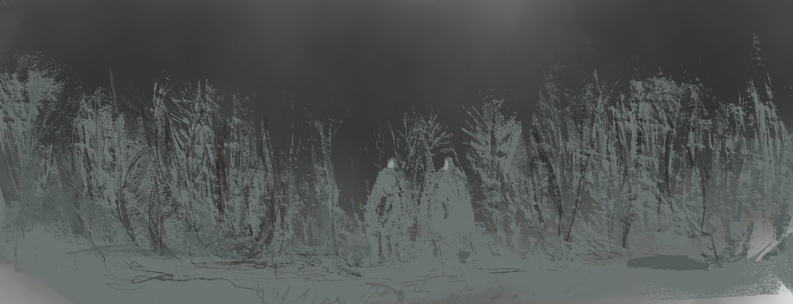
Texture: the way something feels, or looks like it feels. For example, to portray the image of grass, right amount of colour, line and shading need to be apply to create the meaning of texture.

Colour: is the way various qualities of life reflected of objects and capture it by the   eye. It can also have several meanings, such as when the colour is yellow or brow, it has the earthy textures and has the warm feeling, whereas the opposite to those colours, such as blue or black, it has the cool feeling to it.

Line: This element is an identifiable path created by a point moving within certain                space. It is easy to define different paths of line if the artist carefully analyze it. Line        is one of the most important aspect of art itself. There are four different types of          line: horizontal, vertical, diagonal and curved.

Shape : These two elements define objects in space. Most likely to have two  dimensions, such as width, height and depth. However, these two have it's own        aspects and able to tell the differences between these two.

Form

           -Shape: this form has only height and width, just like 2 dimensional painting.

           -Form: this from has height, width and depth, best example for this element                          would be sculpture or other 3 dimensional creations.

Pattern: this form describes the repeated design in the painting or other categories                  of art, e.g. decorative wall where the design repeats itself, or natural like fur or              wood. Pattern can be created by other types of elements such as shape, form,              colour, line etc.


Friday 16 October 2015

Research - Artist no.2: Piet Mondrian

Piet Mondrian

- A Dutch artist who focuses on abstract genre. The reason why I specifically picked out this artist is to understand his simplified abstract style, Neo-Platicism and how I can use this technique on my project. 

 I have struggled with contemporary, abstract art, where it uses bare minimum amount of colour, line and sometimes, there is no texture or even tone to create depth to the painting. Even though it requires not a lot of other elements of art, this specific side of neo-plasticism, where the artist restrict themselves to the three primary colours and to a grid of black vertical and horizontal lines on a white ground.

This gave me an idea how I could combine this neo-plasticism, choosing 3 specific colour, limiting the amount colours to use which could be sensational, a combination of abstract art and digital art.

 
           Composition B (No.II) with Red                                  No.VI/Composition No.II
  
Formal elements of art - Shape

 Shape is simply an area that enclosed by a line and there are two different types of shape, geometric and irregular. The usage of shape will definitely shave a positive outcome of the project. Simple shapes such as triangle, rectangle and circle can be used and will be able to contain numerous meaning, especially to those who concentrate on abstract art, for example, an artist Piet Mondrian with his usage of line and by the usage of line, it creates squares within these line.


 Fascinating part of shape is that, for concept artists who design and create specific designs, understanding each of these shape and able to apply is a vital subject to learn.