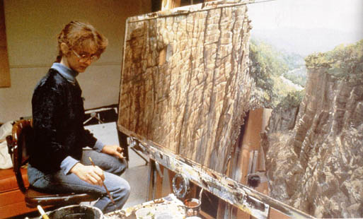
Saturday, 30 January 2016

S.T.W, Still Life

Sam Taylor Wood

 She is a contemporary artist who focuses working in video/installations and photography. Her works on videos, photographs and installations depict human emotions and reactions such as solitary, awkward or vulnerable moments and express it through camera.

 Still Life by Sam Taylor is known as one of the most classical work in contemporary art genre. However, what I didn't know was that it is based upon a particular type of still life painting that developed during the 16th - 17th centuries in Flanders and Netherlands. It is part of classical genre that contains symbols of change or death as a reminder of their inevitability. Its focus was upon confronting the vanity of worldly things through often subtle signs of elapsing time and decay.

 Decomposition and progression.

 These two key settings are what makes this video meaningful and able to express a story to audience. The display of fruit (or rabbit), which soon transforms within a matter of second, into a decaying, perishing objects. Presented in a loop, this set of endless repetition, where life and death acquires endless appeal.

 'S.T-W. - For me, as you look at this bowl of fruit, I feel that it becomes even more beautiful as it decays and as it goes into sort of nothingness. You still have the memory of the beauty and the grace of the passing of time I suppose. And it is also the fact that as you progress through life and you’re getting older and feeling the brutality of the passing of time, it’s nice to be looking at the gracefulness in that.'

 What I didn't notice until the end of the film was the ball point pen next to the fruit basket while decomposition of fruits/rabbit continues. Why specifically a ball point pen to be lied next to these decaying objects?

 Fascinating fact which could be immensely useful towards to the project is the repetition/rotation of certain cycle, learned from this Sam Taylor's video, 'Still Life'.

[Still Life by Sam Taylor Wood]

[A little death, Sam Taylor Wood]

 The video below is the original thought of still life painting which requires human reaction and progression of the painting. The ending will be shown with finished painting with hyper-realistic painting which appears to be alive.

[Old master style still life painting time lapse demo]

Friday, 29 January 2016

Gestalt theory of painting

To explain the full potential of Visual Narrative, it has its patterns and symbolism within the art material, whether that may be a painting, sculpture or photograph. This particular theory may be able to help and understand the use of this proven thesis can be used in visual narrative.

Gestalt Theory - Painting

The whole is other than the sum of the parts. - Kurt Koffka

This quote is a nutshell of Gestalt theory but which will explain later on how this theory will prove its usefulness or not. To simplify, there are 6 different types within the thesis and each of them has its own meaning. Proximity is a form of certain shape when other objects are close together. Similarity is when two objects looks the same but its function is different. Symmetry is a use of same object but placed in opposite direction. It gives a sense of 3 dimensional feeling by combining each other. Continuity is simply a particular direction where your eyes are leaded. Closure is when a completed object can be achieved without having all the parts given.

Fig.1 Gestalt Theory

Personally, I do not really know how I can use this theory into the project with its simplicity. Paintings will be different with by using various elements and it won't look the same nor will it be symmetrical (in the project of mine). It will have its meaning behind the scene but it depends on how the audience observe the painting and do not have to use this theory to prove a point what the paintings trying to tell.

Links for these images:

1: https://firatgunal.files.wordpress.com/2011/04/gestaltprinciples.jpg

Thursday, 28 January 2016

Superviser Meeting no.7

Meeting with Supervisor - Simone O'Callghan
  • Change of the topic for the dissertation
  • Setting up the project theme and how it can work with the dissertation
  • Looking through over the naturalism and realism
  • Depiction of other peoples work and envionrmental painting
Priorities

  • At the moment (with piles of works need to be done), I need to find more research material and work it in a steady pace
  • Steady pace - project and dissertation.

Wednesday, 27 January 2016

Beginning of semester 2, re-thinking of my project

 Due to lack of specific research area, the whole proposal went haywire. To make this more simplified and focused into a certain subject. The fact which I was explaining and rambling around with the use of formal elements of art was rather an easy topic for an honours student who's doing their dissertation. Project which I'm working on is working on a progress and know how its going to be finished and presented but the research areas are vague, as if the researcher is confused or uncertain about their project.

 The fact that I was focused on the use of formal elements to the project was a crucial mistake. This was just a technique of the main project, not the main idea. The fatal flaw was that I couldn't able to express properly what I was telling people with few facts/references to back up with and I realised that I wasn't focused on 1 subject but vast amount. To fix this problem, I had to come up with solid idea first then rest (context, technique, ideas, references etc) can be done.

 ‘Creating narrative stories within the boundaries of painting’

 Project: The most efficient and simple way to describe is that this project aims to research how effective a story can be told by the use of painting. By using specific artists’ skills and techniques from different era and researching case studies related with the project; to interact and able to tell a story to audiences within the boundaries of painting.

 Objectives: Paintings and assets will be made from Photoshop and when all assets have been made, these assets will be modified into a moving concept painting by using After Effects and NukeX to enhance the visual effect of digital paintings. 

 To create this project, using Photoshop and After Effects software will be essential. What I'm worried about is that I have barely used After Effects and since I will be using this software as a main part of the project, I will need to get used to with this software as soon as possible. There is another software call NukeX which is similar to After Effects which I have not used before and contemplating if I should use this software when I'm not certain about it (since I will need to focus on producing paintings and assets from Photoshop and need to learn how to use After Effects).

Matte Painting:Illusion of an environment

Matte painting

 Matte painting is often a painted glass pane that is used to show a landscape or large set piece. It was heavily used to create certain scenes in film-making, such as Indiana Jones or Star Wars. Matte painting is one of the most crucial and original VFX techniques in film industries. To recreate a scene from painting to live footage set in film would have cost significantly more if they haven't used this technique.

 
[Indiana Jones and the Temple of Doom]

[Matte painting - mixture of matte painting and live set]

 One of the main reason why I was intrigued with matte painting is that matte painting is very similar, or it can even be equaled as a realistic painting. Few differences would be that matte painting is a creation of an environment scenes which is either fictional or enhanced version of photograph, whereas photo-realism/hyperrealism is a painting which is exactly identical to the view or photograph. Stepping aside from differences, interesting fact of matte painting is that it is not just about creating a certain environment scenes, its to enhance the view of environment with painters techniques and ideas. One of the ideal example would be a scene from Star Wars: Episode V - The Empire Strikes Back.

[Matte Painting and live set of Star Wars: Episode V - The Empire Strikes Back]

[Matte Painting - Progress of Indiana Jones & Star Wars]

This is just one of the example from Star Wars but to be able to create a scene from a painting and able to utilise it in live set was essential, especially for sci-fi films (material cost to create all these sets back in the day would have costed a lot more than a detailed matte painting).
 As a personal opinion, matte painting isn't all about to create a scene which would not exist in real life, but to able to tell certain expressions within the image and able to inspire the audiences.

Tuesday, 26 January 2016

Research - Digital Artist no.3: Simon Stálenhag

Simon Stalenhag


 Simon is a Swedish concept designer/artist is known for his rare style of painting: ‘highly imaginative images and stories portraying illusive sci-fi phenomena in mundane, hyper-realistic Scandinavian landscapes,’ (http://www.salomonssonagency.se/simon-stalenhag)

 His paintings are clear to understand and able to grasp the situation just by looking at the painting. Also, the combination of robotic sci-fi genre and human relation works surprisingly well. Moreover, the most important case from his paintings is the continuous painting portrays the story within the painting. What I want from him is to understand his style and able to utilize it in my own project.

 One of the part I love and inspired about his painting is that the character depict emotions very well, exactly what I want.

 In order to understand Simon’s painting, analysing one of his painting to get to know fully understand how he can pertain the story within the painting.


 First thing I have noticed was the affection between two human being, male and female. Just by the action they taking in a specific place makes people to think why they are doing this kind of action in this particular set and why they are doing this.


 Compare to other concept artists whom I have conducted, this distinctive artist uses various colours, such as mixture of complementary & analogous colour but using numerous colours does works for this artist because of his unique painting style. His brush strokes are rather clear and simple for others to see.
 Because of this cleanness of the painting, they can figure out the painting much better. I’m very fond of this complicated style, the combination of pertaining human emotion, delicate environment setting and various colour use.

Monday, 25 January 2016

Research - Digital Artist no.2: Feng Zhu

Feng Zhu


 Feng Zhu is a concept artist particularly well known for his art works in Star Wars: Episode III - Revenge of the Sith and numerous amount in entertainment industries, such as Warner Bros and Microsoft etc. His works are in huge scale with incredible details in each parts, but when you look at it more closely, his brush strokes are rather peculiar, as if each strokes has been done carelessly and left it alone.

 I'm intrigued by his unique style of painting and designing skills for either environment or character painting. Sometimes, his brush strokes are quick but at the same time, it's precise enough to see it as a well-detailed painting when you are looking at the full view. Moreover, one of the most important part from his style is to know the perfect use of perspective view.

Taking one of the image as an example, I want to fully understand how he paints, his specific style of brush strokes or perspective view or where he places his characters to match the environment setting. It is compelling that the painting contains enough information to give the spectator their own idea and story but to go more deeper into the painting, more information will be found of this artists’ unique style.

In this painting, the first thing I have noticed was that in some distinctive part, he paints very delicately, nearly hyper realistic. Second part which I have realised was his unique painting style. Quick brush strokes but its clear to see the texture and it is still clear to understand what kind of object it is. The combination of both will be a great help to improve the painting style of mine.


Third part is similar as the second part but it is much clear to see how his brush stroke works the best at. The last part is the concentration of a single object that it can contain. The tower may not be the centre of the painting as a big picture but when you close it up and concentrate on this particular object, it’s noticeable that there are more than one perspective view and the complication of the painting can certainly
works well with each other.


Sunday, 24 January 2016

Research - Digital Artist no.1: Noah Bradley


"I didn't want to become an artist, I wanted to make video games...... I made art, but only as a hobby."

Noah Bradley

'Our grasp of heaven'

He is one of the well known concept artist, particularly known for his use of colour, value and composition of the painting. In each painting, the use of light/value intensity the entire painting and draws audiences attention towards to the painting. Also, the other important fact of his unique style is the usage of colour. By limiting the amount of colour that is needed in each painting, it signifies the each colour has its unique taste and the artist can able to focus even further due to small choices of colour.

 He mentions: 'Being an artist isn't ever about figuring everything out. It's about the process of figuring everything out.'

 I can definitely agree to this sentence of his since I always want to find out all the fact of what I'm trying to figure out. Same matter goes to the creation of art. What I inspire from this particular artist is his brush strokes and how he places his protagonist(s) in specific places to match the environment and the perspective view of the painting.

   http://www.noahbradley.com/                'Chief of the ways'

 As I have mentioned before, the use of colour and value(light) is the most integral part of his painting. Taking specific image, [Chief of the ways] as an example, I've cropped out certain parts from the painting to get a better understanding of his painting. 1st and 2nd cropped images, the brush strokes points towards to the protagonist and antagonist in the 3rd image. Also, another interesting fact in the 3rd image is that both pro/antagonists' vision colide each other, producing a story within the image, as if they were having conversation.

 Moreover, the amount of colour he uses in this painting is very limited [yellow, orange, brown, white, black]. Limitation is one of Bradley's greatest strength in the painting which could be a exponential lesson to learn.

Thursday, 21 January 2016

Superviser Meeting no.6

Meeting with Supervisor - Simone O'Callaghan


  • Start looking at Sam Taylor Wood - Still life
  • Check with the amount of time in the animation
  • Depicting certain elements and how it can affect each painting and the animation in the end 
  • To get the movement from the painting, I need to understand the differences between still image and movement
  • To get the general idea, I need to start looking at the painting and the photography: differences, similarities and how it can benefit personal project and others etc
  • Need to understand and acquire knowledge of art history (specific ones which relates to what I'm currently doing)
  • Stay true to as an artist - What am I and what work will I produce with the technique I already have?